Unlocking Financial Insights: How to Scrape and Analyze Google Pay Transactions with Python

Typically Google Pay transactions are not easily analyzed. Google Pay has different flavors in different countries the capabilities of the app varies. If you want to analyze your spending in

In this post, we’ll explore how to automate the process of scraping and analyzing your Google Pay activity using Python. By the end of this post, you’ll be able to extract transaction data, categorize transactions, and save the data for further analysis.

Prerequisites

Before we begin, make sure you have the following prerequisites:

  • Basic knowledge of Python.
  • Familiarity with HTML.
  • Python libraries: BeautifulSoup and Pandas.

You can install these libraries using pip:

pip install beautifulsoup4 pandas

The first step is to download your Google Pay activity as an HTML file. Follow these steps:

Step 1: Download Your Google Pay Activity

  1. Open the Google Pay app on your device.
  2. Navigate to the “Settings” or “Activity” section.
  3. Look for the option to “Download transactions” or “Request activity report.”
  4. Choose the time frame for your report and download it as an HTML file.

You can also look at the video.

Step 2: Parsing HTML with BeautifulSoup

We’ll use BeautifulSoup to parse the downloaded HTML content. Here’s how to do it:

from bs4 import BeautifulSoup

# Load the downloaded HTML file
with open('My Activity.html', 'r', encoding='utf-8') as file:
    html_content = file.read()

# Parse HTML content
soup = BeautifulSoup(html_content, 'html.parser')

Step 3: Extracting Transaction Data

The Google Pay activity HTML contains transaction data within <div> elements. We’ll extract this data using BeautifulSoup, In this step we found the outer cell based on style and also leverage the regular expressions to extract the various transactions in Google Pay including “Paid, Received and Sent”.

# Find all outer-cell elements
outer_cells = soup.find_all('div', class_='outer-cell mdl-cell mdl-cell--12-col mdl-shadow--2dp')
action_pattern = r'(Paid|Received|Sent)'
# Extract and store the action (Paid, Received, Sent)
# Iterate through outer-cell elements
for outer_cell in outer_cells:
    # Find content-cell elements within each outer-cell
    content_cells = outer_cell.find_all('div', class_='content-cell mdl-cell mdl-cell--6-col mdl-typography--body-1')
    action_match = re.search(action_pattern, content_cells[0].text)
    if action_match:
        actions.append(action_match.group(0))
    else:
        actions.append(None)

Step 4: Handling Date and Time

Extracting the date and time from the Google Pay activity HTML can be challenging due to the format. We’ll use regular expressions to capture the date and time:

date_time_pattern = r'(\w{3} \d{1,2}, \d{4}, \d{1,2}:\d{2}:\d{2}[^\w])'
    date_time_match = re.search(date_time_pattern, content_cells[0].text)
    if date_time_match:
        dates.append(date_time_match.group(0).strip())
    else:
        dates.append(None)

Step 5: Categorizing Transactions

To categorize transactions, we’ll create a mapping of recipient names to categories. This would help to consolidate the expenses and analyse the expenses by category.

recipient_categories = {
    'Krishna Palamudhir and Maligai': 'Groceries',
    'FRESH DAIRY PRODUCTS INDIA LIMITED': 'Milk',
    'Zomato':'Food',
    'REDBUS':'Travel',
    'IRCTC Web UPI':'Travel',
'Bharti Airtel Limited':'Internet & Telecommunications',
'AMAZON SELLER SERVICES PRIVATE LIMITED':'Cloud & SaaS',
'SPOTIFY':'Entertainment',
'UYIR NEER':'Pets'

    # Add more recipient-category mappings as needed
}

Step 6: Automating Categorization

Now, let’s automatically categorize transactions based on recipient names and prepare the data frame:

# Map recipients to categories
df['Category'] = df['Recipient'].map(recipient_categories)

# Reorder columns
df = df[['Action', 'Recipient', 'Category', 'Account Number', 'Amount', 'Date', 'Month', 'Year', 'Date and Time', 'Details']]

Step 7: Saving Data to CSV

Finally, we’ll save the extracted and categorized data to a CSV file:

# Save the data to a CSV file
df.to_csv('google_pay_activity.csv', index=False, encoding='utf-8')

Now, you have your Google Pay activity data neatly organized in a CSV file, ready for analysis!

Outcome

You can see that mapping has worked automatically and CSV has been generated. Sample output shared here for quick reference.

Conclusion

In this post, we learned how to automate the process of scraping and analyzing Google Pay activity using Python. By following these steps, you can easily keep track of your financial transactions and gain insights into your spending habits.

Feel free to share your comments and inputs.
Selecting a visualization

Key aspects of selecting visualization

There are many aspects of visualization of data. Many times we tend to get confused how to visualize a data and convey it either as meaningful insight or information which can be inferred upon. The selection visualization is critical from the following context:

  • Easy of inference
  • Ability to gain insights from visuals
  • Helps in decision making
  • Infer outliers and enable to act
  • Simplify complex data situation
  • Convey a story about the data

Case Study:

You are waiting in a railway station for a train, you know your train number you also have a planned time of departure but you wanted to understand the following while you wait:

  • Will the train be on time ?
  • Where is it currently located ?
  • Any possibilities of delays expected ?
  • What has been the history of timely arrivals in the past ?
  • How long the train will halt in my current station ?
  • Do we have accurate positioning of the coaches ?
  • Am I standing at the right position to board my coach ? If not how far or how many steps I should I walk to reach the correct position ?
  • Based on current speed of train what is the predictability of reaching my destination on planned time ?
  • Does the coach I’m planning to board has facility for differently abled ?

So when we want to provide visualization to the end user we need to understand the Context/Questions to be answered/availability of data. Need to understand what is to be compared, filtered, correlated , data over time.

Where to look for some ideas:

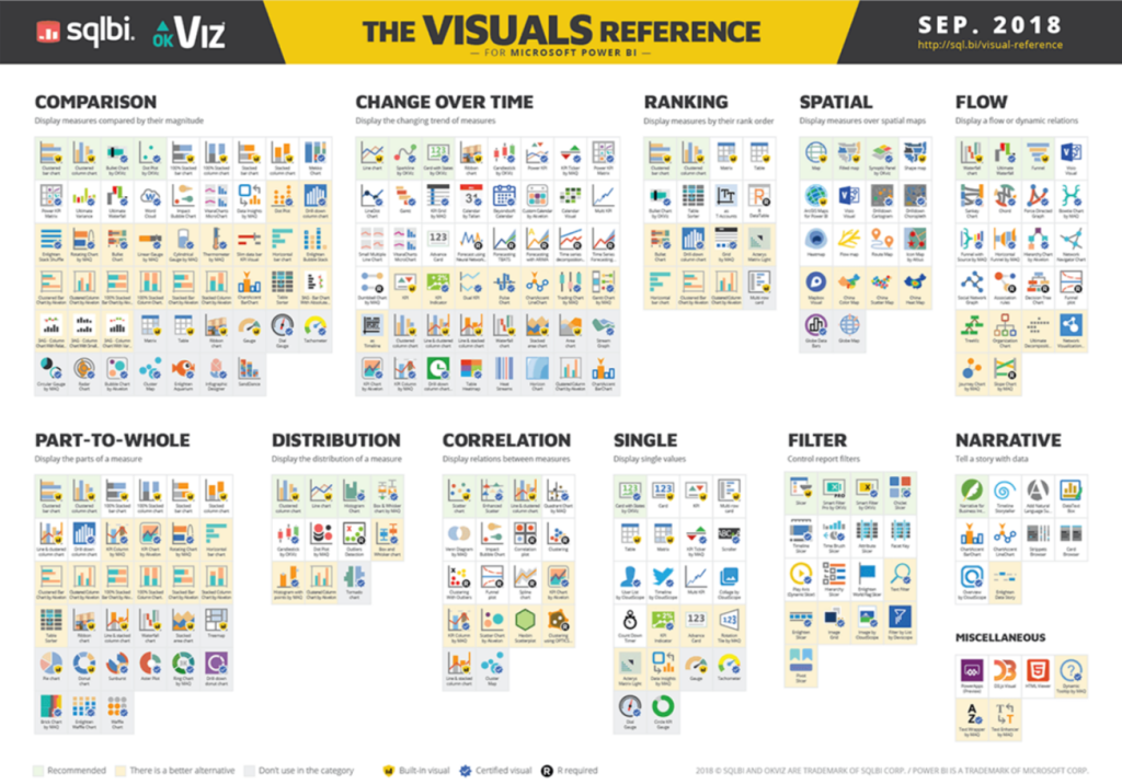
Data Visualization Catalogue – https://datavizcatalogue.com/blog/chart-selection-guide/

https://www.sqlbi.com/ref/power-bi-visuals-reference/

Why credit scoring to be done in-house in financial institutions?

Credit scoring is very essential components for the financial institutions to manage the lending process seamless. Its also critical for the process to be simple, powerful and effective. Credit scorecard is the tool to make it happen. Its also always important to have the credit scorecard for the following reasons in general:

a. Increased regulations and compliance requirements
b. Complexity of data growth
c. Varied data sources
d. Greater availability of Machine learning and data sources at lower costs
e. Sharing of subject matter expertise at corporate level
f. Creating value based on existing organization practices
g. Improved customer experience in a unique way

Why it is to be done in-house?
1. Decrease the dependency on experts and manual systems
2. Faster response to customer applications
3. Availability of data infrastructure and governance
4. Attract credit worth customer and don’t loose them
5. Deeper penetration and understanding of risk pool of potential customers
6. Lower cost of ETL software and data analytics
7. Availability of low cost data storage and retrieval systems

Lessons from wordpress stats dashboard

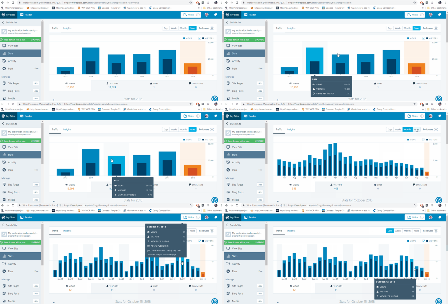
In continuation to my previous posts this posts discuss about the wordpress traffic dashboard.  WordpressTraffic

Analysis by Period:

The dashboard provides bar charts with Days, Weeks, Months and Years as the period on the Top tab. Interestingly the dashboard also shows the Followers count on to the top right.

The Dashboard provides inputs on Views, Visitors, Likes and Comments. This will help determine the Interactivity status of the sites. Views to be converted to likes and comments are good indications about the content quality and the ability.

Insights:

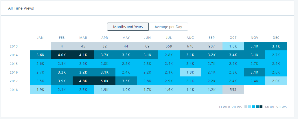
Insight dashboard provides the heat map view by month and years. It helps you understand which years the posts and its content has obtained more visitors. We could also realize that in the 2018 the trend is declining compared to all previous years from the chart below.Insights Heatmap 1

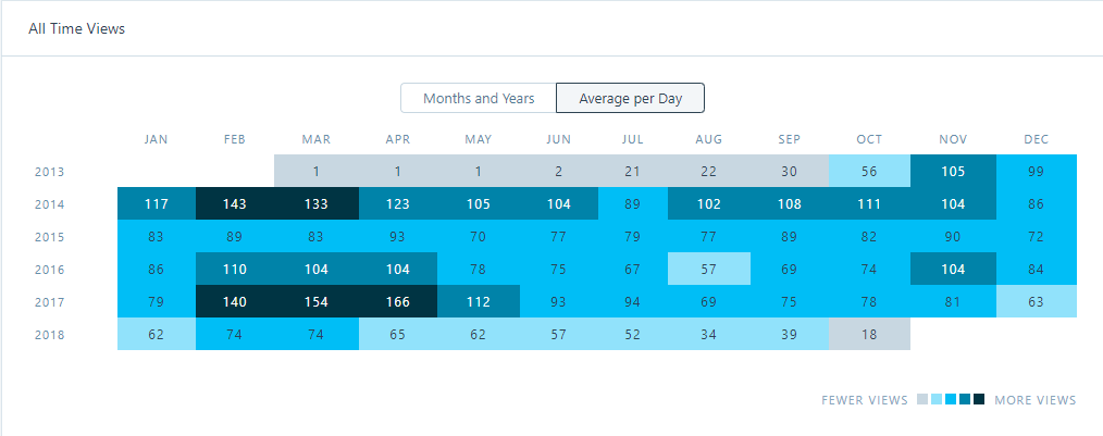
In March of 2014 and 2017 there is significant number of people who has visited the site. The below given insights on the heatmap provides the average number of views the site is receiving per day across years. Insights Heatmap 2

Other key insights it delivers:

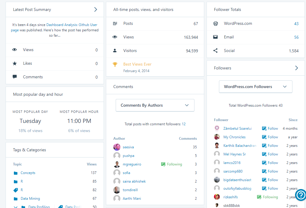
wordpress other dashboard.png

It answers some of the key questions about your blog, which  can help you to take actions on as well.

  1. How well is your recent post doing ?
  2. Are we having any new followers in the recent times (past 2-3 months) ?
  3. Which areas the content is being written more ?
  4. Who are all interacting in the blog posts more ?
  5. When did we received the best views?
  6. How is my overall site content doing in terms of Posts, views and visitors ?
  7. How is health of site following ?

Key summary/inference:

The key take aways for dashboard designers and visualization people:

  • Focus more on answering the questions visually.
  • Understand how the facts can be presented in clean and clutter free way
  • Organize the content in tabs/groups so that interpretation would be easier for the end users
  • Provide visual representation for comparison like heat map for quicker inference and also trend for the user to interpret in his own way.
  • Content layout and filters would be a good combination to minimize clutter.


Dashboard Analysis: Github User page

This post discusses about the github dashboard design and its aspects.

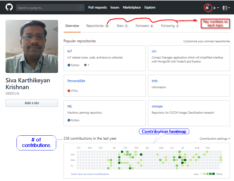
Siva Karthikeyan Krishnan Github Dashboard

Data Visualization aspect:

Heatmap has been used to show the contribution by specific months in the colums and weekdays in the rows.  On hovering the mouse to the specific marker in the heatmap contributions can be seen as well.

contributions

The number of contributions on the top left of the contributions heatmap gives a very quick insight in terms of the overall contributions  in the last year.

Change in the timelines:

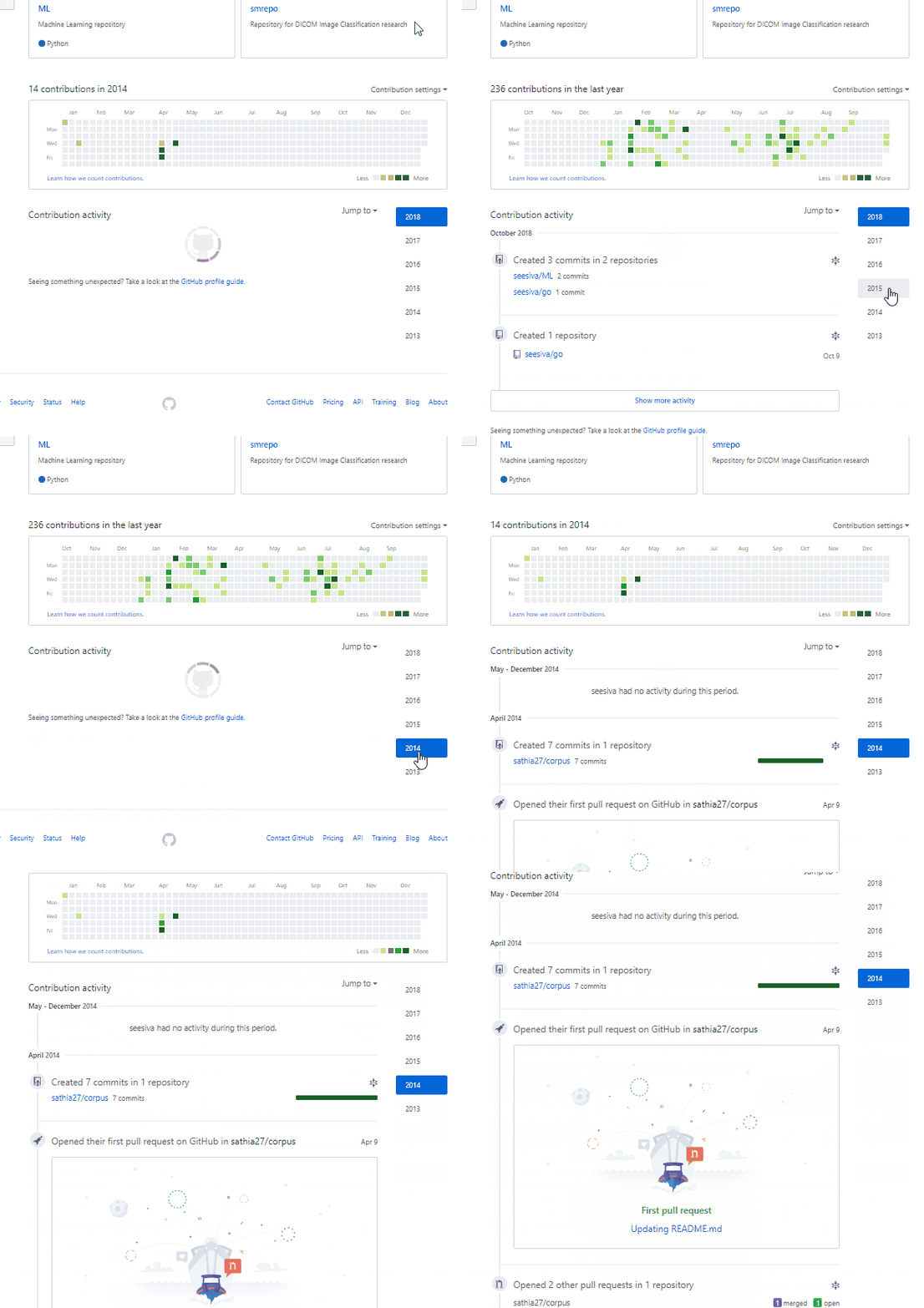
The change in timelines shows the respective changes in the contribution heatmap as well. This interactive behavior gives the user a good experience.

timelines.gif


We will understand some other dashboard in one another post.

gRPC Server and Client – Step by Step – Part 1

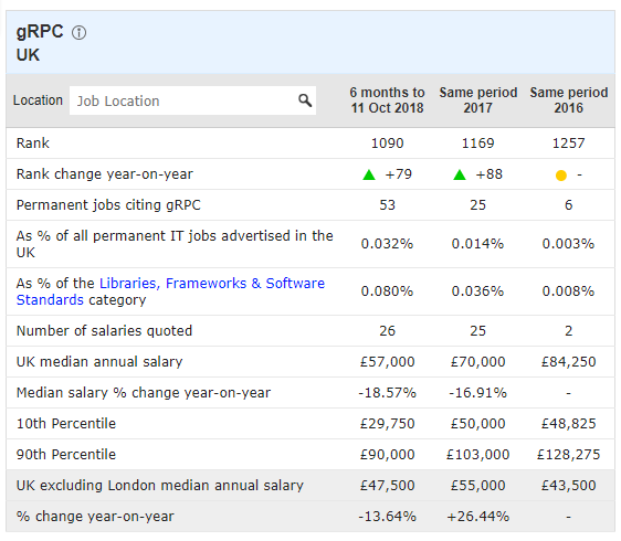
Many would have been exploring gRPC. The skill demand is in the increasing trend in the libraries and frameworks. See the https://www.itjobswatch.co.uk/jobs/uk/grpc.do as reference.

2018-10-11 14_06_58-gRPC jobs, average salaries and trends for gRPC skills _ IT Jobs Watch

This post is an attempt to provide step by step instruction on writing a Microservice based on gRPC. To keep things simple, we will develop a simple service to check if a given service would provide boolean result when a string is provided to it. This is entirely done in python.

Step 1: Write a simple function in python to check if the given inputString is Palindrome or not.

palindrome

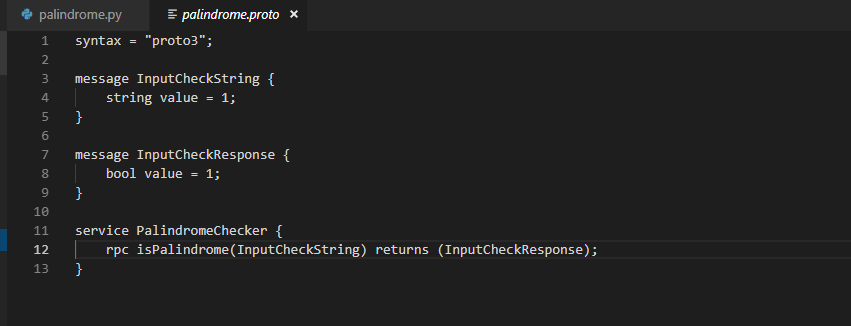
Step 2: We will add a “.proto” file which would be having the schema definition of both the input and output response.

palindromeproto

Step 3:  Install the necessary grpc tools which can be installed using the following commands:

pip install grpcio
pip install grpcio-tools

Step 4: Now generate Stub and Servicer using the installed tools as given below commands:

python -m grpc_tools.protoc -I. –python_out=. –grpc_python_out=. palindrome.proto

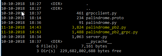
This will generate two files as given in the picture below:

grpc files created

Till now we have completed the steps necessary to create grpcserver and grpc client.  we will see the next server and client in our next post.


Sending data in data pipelines using protocol buffer

When we are building data pipelines, we are dealing with different systems along with it. We might need to have appropriate protocol which needs to be managed effectively. These needs to be reusable, easy to validate, small in size, efficient and language-agnostics to manage different systems and subsystems.

The answer to this challenge is Protocol buffer and obviously the alternative could be the Thrift. Protocol buffer is created by Google in 2008 used as an internal protocol for faster communication.

Steps involved in adopting protocol buffers:

  1. Define the .proto file
  2. Build that into appropriate class files using compiler choices of your language
  3. Implement the class in your application
  4. Encode the data through serialization and send the data
  5. Decode the data at the receiving end and use it

Schema:
a. Indicated aliased with number and a tag
b. Required, optional and repeated
c. It can be extensible

Advantages of using the Protocol buffer would be as follows:
a. Takes up less space
b. Faster transmission
c. Faster validation of data structure
d. Easy to modify schema

Quickly get sense of data using Pandas

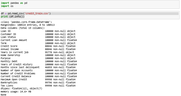
Sharing some of the tips to get sense of data. We can use HEAD in many ways to get an understanding of the data, in this case we will use the credit data credit_train.csv. You can access this dataset from kaggle.

dataframe_info

Now we were able to get to the info=> memory usage, 19 columns and 100514 rows in the dataset. To quickly get a sneak peak into the data we can use head or tail which would be very handy.

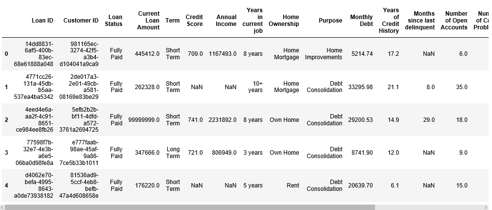
We can use df.head() to get to the top 5 rows to have quick sneak peak into the data when we starting a data exploration work.

credit_data_Head

We will see more such ways to gain exploratory techniques using pandas to understand the data better  in the future posts.

Essential data manipulation approaches

Data Manipulation involves various aspects including structuring, validating, enriching, discovering and cleaning, etc., Here are some of the aspects involving to get to the right data before exploring the data and further training it.

  • Replacing spaces values appropriately
  • Dropping the null values based on the volume of missing data
  • Data type conversion (e.g., integer to float)
  • Replacing the category values to bring consistency based on business need
  • Binning – Converting numeric data to category buckets (e.g., Age into Age group Buckets)
  • Boolean Indexing – Filtering values of a columns based on another set of columns and its conditions. Boolean Indexing can be adopted based for these kind of scenarios (e.g., Filtering out female bank accounts for special schemes based on Age, Gender and Educational Qualification)
  • Fill the Not available values using mode/median and mean values

Prognostics as per the ISO 13381 Standards

International Organization for Standardization has provided guidelines for Mechanical vibration and shock for Condition monitoring and Diagnostics of machines. This would focus on the following areas:

1. Detection of problems (Deviation from the norms)
2. Diagnosis of the faults and their causes
3. Prognosis of future fault progression
4. Recommendation of actions
5. Post Mortems

Prognosis requires good understanding of:

a. Probable failure modes
b. Operating conditions and failure mode relationship
c. Future options which the machined would be subjected

To perform prognosis its very essential to collect historic data, its condition and performance parameters. According to the definition in 13381-1(3) prognosis is defined as “Technical process resulting in determination of remaining useful life”.

Two potential predictions exists:
a. Predict how much time is left before a failure based on current operating conditions
b. Predict on the probability in which machines operates without potential failure